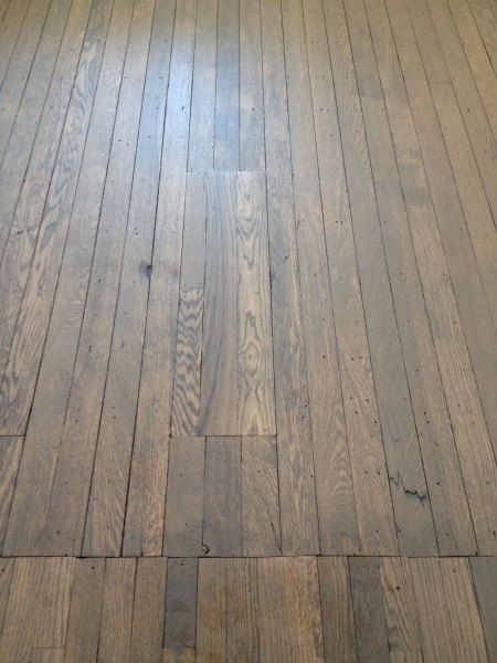
When the redeveloped El Moore’s first residents start moving in in early June, they might notice something interesting about the historic flooring in their apartments:
See that distinct line at the bottom of the photo above? That’s where a wall used to be, before we removed it during construction. It’s now become a kind of remnant, a visual reminder of the building’s long history and its evolution over time.
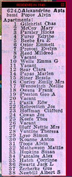
We removed several walls during construction after we decided to redesign the layout of the El Moore’s apartments. We weren’t the first ones to think about overhauling the space inside the 1898 building; its original eight luxury units (two per floor) were divided and subdivided several times in the years after the Great Depression (and probably before that, too). In fact, according to census records, by 1940, there were 38 apartments on the building’s four floors, with another in the basement.
Our current configuration includes 12 annual rental apartments on the El Moore’s second, third, and fourth floors. (That’s in addition to the new rooftop cabins and hostel rooms on the ground and garden levels).
We thought it would be interesting to take a look at three versions of the El Moore apartments’ floor plans over time and see what they have to tell us about how life in Detroit, and in apartment homes, has changed over the last 117 years.
1898
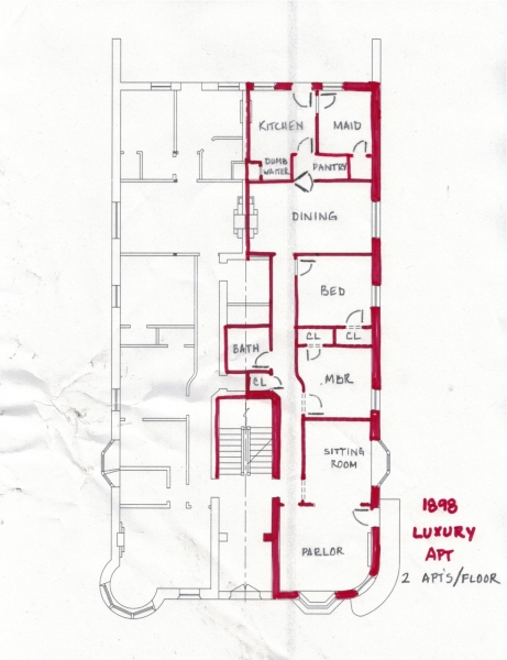
In 1898, it was all about luxury at the El Moore Flats, as the building was originally known. Built during a boom time that saw many wealthy Detroiters moving from downtown to the (literally) greener pastures of the Cass Farms area (now Cass Corridor/Midtown), the El Moore’s original inhabits were well-to-do families whose long, narrow, two-bedroom apartments included formal parlors and maids’ quarters.
Residents of the time would have entered the building through the shared front door (bottom center), which would have lead them to an entry lobby containing a marble-clad staircase that provided access to each of the building’s four floors. Each floor contained just two apartments; in the image above, the walls have been highlighted red so that we can better see how those apartments were laid out.
Here’s an interesting sign of the times: notice how far away the kitchen is from the sitting room. We take it for granted in 2015 that the kitchen is the heart of the home, where people naturally congregate during a party, but apparently that wasn’t how things worked in 1898, when it was the El Moore’s residents’ maids who did the cooking. Notice too how much living space is taken up by those long hallway that were necessary to navigate through the narrow apartments.
1940s-1990s
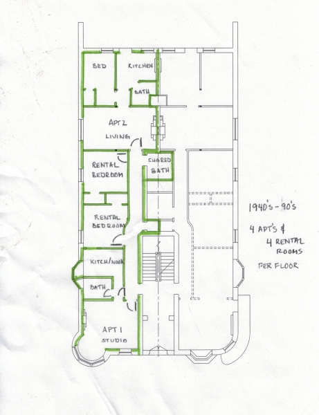
By the 1940s, times were tough in the Cass Corridor, which had been hit hard by the Great Depression and which was, for the most part, no longer a neighborhood that Detroit’s wealthy families called their own. As the building became home over the intervening decades to single people, low income residents, as well as students, the apartments got and stayed smaller. Notice in this floor plan how there are now eight units per floor (including apartments and single boarding rooms). You can also see how the original luxury apartment’s sitting room (lower left) was transformed into a bathroom and kitchen nook for a studio apartment.
The shape that juts from the kitchen/bath is a bay window — notice how the owners at the time, in their attempt to create some separation between the kitchen and the bath, constructed a wall that went right up to the window. The current construction team found those walls intact, the drywall caulked right to the glass.
2015
If it seems a little crazy to build a wall up to a window, we should acknowledge that there is a serious design limitation that anyone subdividing the El Moore’s eight original apartments, us included, has had to reconcile with: the meandering, central masonry wall that originally divided each floor’s two units has to stay put, since it provides necessary structural support to the building. So any attempt to subdivide the original units has to stay within that the boundaries of that narrow, twinned footprint.
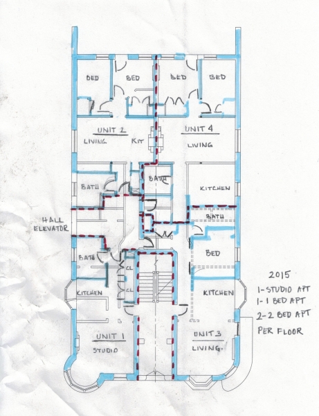
Our version of the El Moore has one studio, one one-bedroom, and two two-bedrooms per floor. You can see all of them, divided by the red dotted lines, here:
Residents of the El Moore in 2015 and beyond won’t enter from the shared entrance that the original residents used. Instead, they’ll come in through new halls adjacent to our new elevator tower (itself adjacent to the new parking lot) on the west side of the building.
Our design team preserved few of the original or mid-century room divisions. Where there was a kitchen in 1898, now there’s a bedroom. Formal dining room? Now a living room. Single rental bedroom? Now a bathroom. The only real exceptions are the maids’ quarters, which have remained bedrooms from 1898 until today, and the studio apartments in the building’s southwest corner, which will have been studios since at least the ’40s. (But don’t worry, we moved the bathrooms and tore down the walls that bisected those beautiful bay windows).
Readers of this blog know that at the Green Garage and at the El Moore, environmental sustainability is always a major influence on our building design decisions. One way that sustainability factors into our redesign of the El Moore has to do with livable area; by eliminating those long hallways and grand parlors, there is a significantly reduced need to heat and cool spaces that only lead to living spaces. And the apartments themselves, while roomier than they were between the ’40s and the ’90s, are relatively small, compared to those original flats. This decision is owed to our contemporary understanding that bigger is not always better, especially where sustainability is concerned, and that more and more people are choosing to live in small, urban places, in part because that’s all they need and in part because it helps reduce their impact on the environment.
Thanks to Joe Gallagher, who marked up the floor plans and walked me through them, and Jason Peet, who helped me understand some of the historic and contemporary design decisions.

